NRBY Events
Connecting people to passions
Creating website re-brand and user experience event based experiences
Client
April 2023 - July 2024
Services
-
UX Audit
-
UI/UX Design
-
Competitive Analysis
-
Wireframing
-
Prototyping
-
Design System Creation
-
Responsive Design
-
Dashboard Design
Summary
Mission
NRBY Events needed a comprehensive website redesign to improve event discovery for users and provide a more intuitive, powerful dashboard for event creators. The goal was to modernize the platform’s dark-themed interface while enhancing usability, mobile experience, and ticket purchasing efficiency.
My Contributions
I led the UX and UI redesign process from initial audit through high-fidelity mockups and prototyping. This included competitive analysis, information architecture, interactive design, and design system development, while collaborating closely with stakeholders and developers to ensure successful implementation.
Overview
NRBY Events connects users to local happenings through a bold, dark-themed interface with red branding. The platform caters to both event attendees and organizers, offering ticketing tools and predictive analytics. The redesign sought to elevate the user experience for both groups—streamlining event discovery, simplifying ticket purchases, and enhancing the event creator dashboard with more powerful tools.
Challenge
The existing platform had usability issues in its ticket purchase flow, inconsistent mobile performance, and limited discoverability features. While the dark theme made NRBY visually distinctive, it presented accessibility challenges and lacked visual hierarchy. For event creators, the dashboard was underutilized due to complex navigation and limited data visualization.
Solution
We reimagined the platform experience for both user types. The event discovery journey was made more intuitive with improved filtering, search, and map-based browsing. A cleaner event card layout and revamped detail pages ensured key information was easy to scan. For creators, the redesigned dashboard offered robust predictive analytics, improved attendee management, and streamlined event setup. The mobile interface was redesigned to optimize performance, form completion, and location-based discovery.
Results
The redesign positioned NRBY as a more competitive and user-centric platform in the event discovery space. Early testing showed improved clarity in the ticketing flow and increased user satisfaction with mobile usability. The upgraded dashboard empowered event creators with actionable insights, and a revamped checkout experience was optimized for higher conversion rates.
Impact
Users have an easier time searching and selecting events. Event creators have more flexibility and control over events with the new features
25%
Estimated improvement in mobile form completion rate
15%
Increase of event creators
joining Nrby
THE PROCESS - STEP 1
Discovery & Research
Auditing the existing platform and user experience
Desktop & Mobile Audit
I conducted a thorough review of NRBY's dark-themed interface and minimalist navigation. Key insights included a fragmented ticket purchase experience, underutilized profile pages, and accessibility challenges. On mobile, the 4-step checkout flow proved cumbersome, with inconsistent responsiveness and slow load times for image-heavy event pages.
User Experience Evaluation
I mapped friction points across the platform—particularly within the event detail pages and QR-code-based ticket distribution. I assessed accessibility issues and evaluated how clearly the platform communicated event data. A lack of hierarchy and weak social integration were major areas for improvement.
Audits
THE PROCESS - STEP 2
Competitive & Market Analysis
Positioning NRBY within the event tech ecosystem
Competitor Benchmarking
I compared NRBY’s platform against Eventbrite, Meetup, and Facebook Events—focusing on ticket flow, mobile performance, and dashboard usability. NRBY’s dark theme offered brand distinction, but lacked clarity and polish. Competitors excelled in user onboarding and category filtering, areas NRBY would need to strengthen.
Market Trends
I researched user preferences around event discovery, including personalized recommendations, map-based search, and streamlined checkout. Predictive analytics stood out as a strategic advantage for NRBY—highlighting an opportunity to lean into data-driven event promotion and sponsor integration.
THE PROCESS - STEP 3
Information Architecture
Creating a visually compelling and functional website
Site Mapping
I reorganized the main site structure around clearer categories and pathways: “Create Event,” “View Events,” “About,” and “Blog.” Relationships between event detail pages, profiles, and ticket flows were mapped out to ensure smoother user journeys.
User Flows
I redesigned core user flows—especially the 4-step ticket purchase process and event creator dashboard navigation—to reduce cognitive load and shorten completion time. Enhanced search and filtering were also included as part of the revised user discovery journey.

Site Mapping
THE PROCESS - STEP 4
Design & Prototyping
Crafting responsive, user-friendly interfaces
Wireframes & Prototypes
Low-fidelity wireframes addressed layout improvements for event cards, detail pages, and dashboards. I developed interactive prototypes of the ticket purchase flow, a redesigned creator dashboard, and mobile-first layouts—testing location-based discovery and QR-code delivery integrations.
User Testing
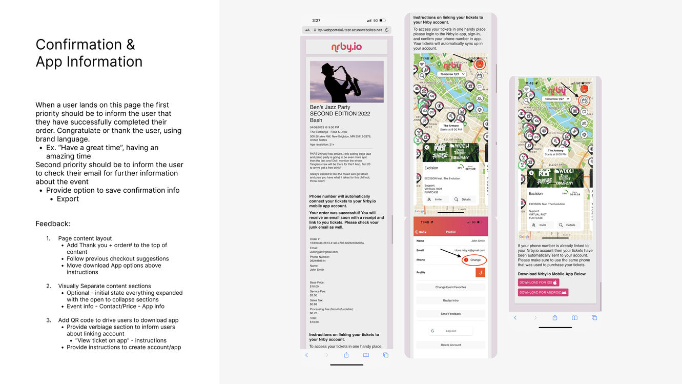
I conducted usability testing with a focus on the web and mobile checkout experience and dashboard functionality. Insights from these sessions guided refinements to the event creation process, visual hierarchy on detail pages, and confirmation messaging after ticket purchases.
THE PROCESS - STEP 5
Visual Design & Implementation
Building a polished, consistent design system
Visual Design System
I refined the dark theme for better readability and contrast, introducing a modern type system, expanded color palette, and a robust event card component library. Icons, animations, and photography guidelines were developed to support consistent branding.
High-Fidelity Mockups
Final designs included a bold homepage showcasing curated events, improved map-based discovery, streamlined checkout, and a reimagined event creator dashboard. Responsive layouts were optimized for mobile, tablet, and desktop usage, ensuring performance and consistency.
Site Design Concept

Actual Site

Gallery


